In situations where more than one probability can effect the eventual outcome or direction or the value of something relative to all variables, it could be said to be dynamic, or fluid as relates to the interaction and probabilities in total.
A Standard Deviation from the norm or one that occurs approximately 7 out of every 10 instances as well as the rest of the scale can be plotted on a chart in any number of ways, classically it is charted via Bell curve which looks like this:
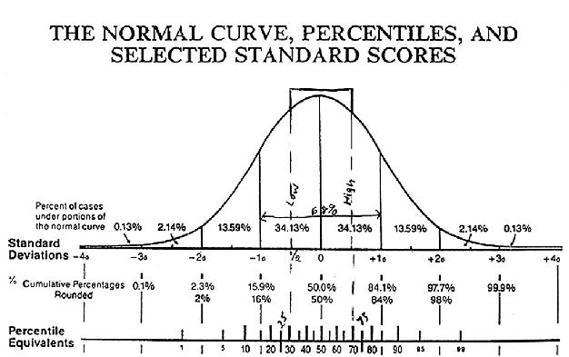
Some deviations from the mean are extremely rare and are off to the right or left of this graphical example.
This brief blog is intended to lay the groundwork for understanding and graphical and a formula to represent interactive bell curves.
The point would be to better predict the actual effect of shocks and inefficiencies or news and general fundamentals as well as technical factors involved in security price moves.
Generally speaking I postulated that each piece of news or fundamental or technical information affected the overall price and value of a security. Depending on the size of the event and variation from the normal distribution as to size of each factor taken together determines price action.
I have several blogs on the earlier posts in archives regarding (CMI) this and how it would work.
To move this along one tiny bit in this blog taking two standard distributions of a small sample you could chart them in a number of different ways:
By itself:
With another data set:

or possibly with a better graphical interface than is available to me at the moment opposed or mirror imaged:
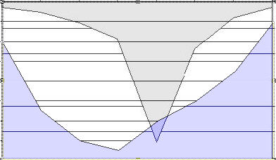
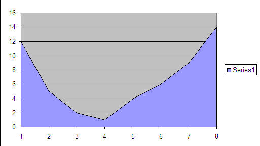
A data set for the last graphic might look like such:
1-3-9-27-7-4-2-1
12-5-2-1-4-6-9-14