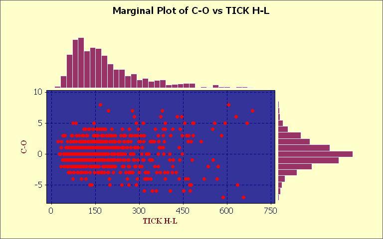
Kind of Esoteric, but the concentration of lower volatility bars is around the concentration of the lower volatility of $TICK.
The outliers and extremes to the right upper and lower sections of the chart could help identify when you have a rare instance of high volatility on both.
This would have to be looked at vs a candlestick chart to see if it normally indicated a reversal or further trend, but it would likely be the top of volatility when both are very extreme.